Ecommerce Checkout Process
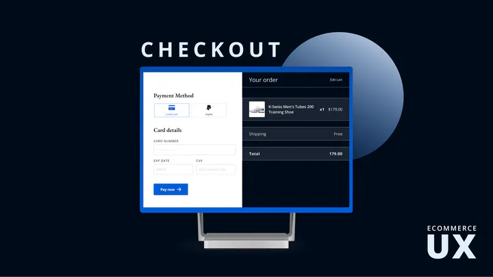
The problem
A complicated multi-step checkout is one of the most common reasons ecommerce carts get abandoned right at the point a store has already done the hard work of getting someone to want to buy. This project — a case study for an ecommerce client — set out to make that last step less costly.
Constraints
This was a UX research and design engagement, not an engineering one — the deliverable was a redesigned flow and the reasoning behind it, not a shipped storefront. I didn’t have access to the store’s actual abandonment analytics, so the work leaned on established checkout-UX research and heuristic evaluation rather than a live before/after test.
What I did
I mapped the existing checkout step by step, looking for where it asked users for more than the current step needed, where it introduced friction (forced account creation, unclear progress, redundant fields), and where trust signals were missing. From there I redesigned the flow to be simpler and more seamless, with the explicit goal of getting a customer from cart to confirmed order with as little resistance as possible — and getting them back again next time.
What I’d credit
The deliverable was a full simplified checkout flow, not a production A/B test, so I can’t claim a measured lift in conversions. What it sharpened for me was a habit I still apply to any interface, ML-powered or not: friction shows up step by step, and removing it is a design problem before it’s ever a technical one.
Full case study on Behance.