Grow Registration Form
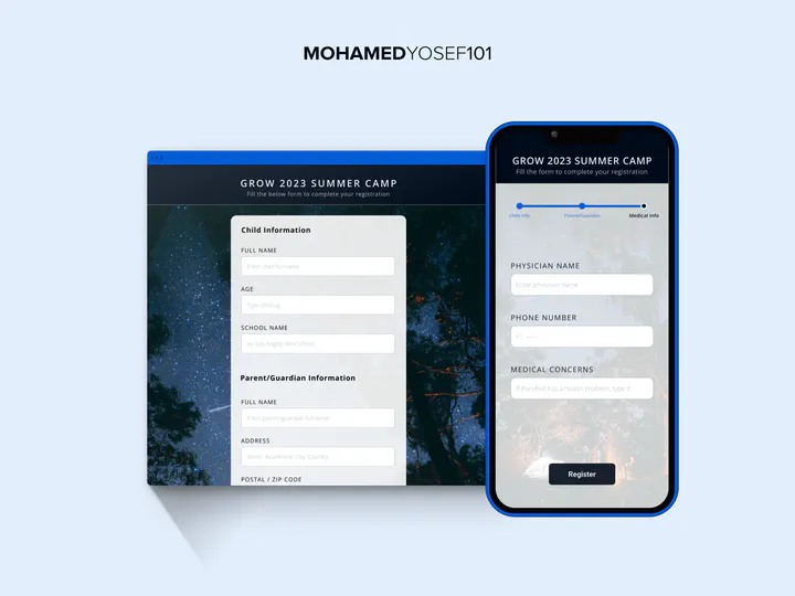
The problem
Long registration forms get blamed for drop-off, and the usual fix is “reduce the number of steps.” Grow’s registration form was the case study I used to test whether that assumption actually holds — or whether something else was really driving the effort users felt.
Constraints
This was purely a UX research exercise — no access to Grow’s real signup funnel data, so the work was grounded in usability heuristics and existing research on form design rather than live conversion numbers.
What I did
I went through the existing registration flow step by step and evaluated what each step actually asked of the user — not just how many steps there were, but the type of effort involved (recalling information, making a decision, verifying something) at each one. That reframing became the core of the recommendations: step count is a weak proxy for effort, and it’s what happens within a step, more than how many steps exist, that predicts where users get stuck.
What I’d credit
The output was a set of concrete recommendations for restructuring the form’s steps by the kind of effort they demand, not a measured before-and-after. It left me with a rule of thumb I still use when a form, or an onboarding flow, feels “too long”: count the decisions, not the steps.
Full write-up on Behance.