TStore Product Details
The problem
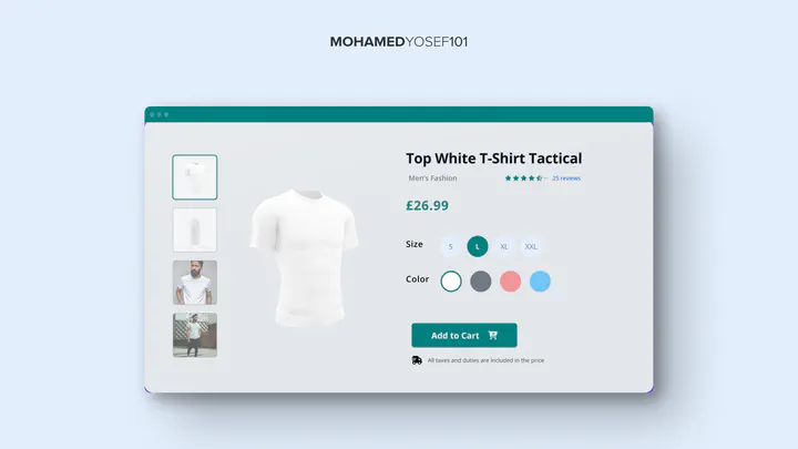
TStore’s product details page — the page a shopper lands on right before deciding to buy — was the focus of this project: does it give someone enough information to decide quickly, and does it make them want to come back.
Constraints
This was UX research and redesign work on an existing page, not a rebuilt storefront — the deliverable was a reworked product details page and the reasoning behind it, evaluated against usability principles rather than live sales data.
What I did
I reviewed the existing page against what actually drives a purchase decision at that stage — clear product information, trust signals, and an easy path to checkout — and reworked the layout and content around those priorities rather than around what was easiest to build. Loyalty was treated as part of the same problem: a page that’s clear and trustworthy the first time is also the one a customer is willing to come back to.
What I’d credit
The output was a redesigned product details page, not a measured lift in sales or repeat purchases — I don’t have TStore’s data to point to. It’s a small, early example of a pattern I keep coming back to: good UX and good business outcomes are usually the same design problem, described from two different angles.